A look behind the scenes of our IBM Technology Garden
The story of the Technology Garden
A bit of context
Every year at the Wimbledon Championships, IBM analyses millions of data points, from match and player statistics through weather forecasts to cyber security events and website metrics. For the 2019 edition, George P. Johnson Experience Marketing (GPJ UK) invited Variable to collaborate on Technology Garden and bring that data to life, enabling IBM to tell their story like never before.
In November 2019, IBM Technology Garden won bronze in the Unusual category of Kantar Information is Beautiful Awards in London.
The brief
“Our creative concept is the IBM Technology Garden where digital plants in the garden are grown using IBM tournament data. An artistic manifestation of moments of greatness enabled by technology.” — GPJ
Theme: Tennis in an English Garden

Our response
When working on expanding the concept of digital garden we draw inspiration from two major concepts:
- Colors of UV light photography — a technique used by scientists to expose patterns visible only to insects like bees that see a wider spectrum of light than humans. This is similar to the role of IBM’s data visualisation in “showing the invisible”.


- Forms driven by the concept of morphogenesis — a biological process that causes an organism to develop its shape. We perceive this as a metaphor of flexibility of IBM software offerings that can constantly change and adapt to rising challenges imposed by Wimbledon and our ever more data driven world.

Process
We started the project by looking at the types of data available in sample JSON and how it maps to different themes we wanted to talk about (e.g. “Tracking every shot” would use match statistics and “Securing the tournament” would respond to number of cyber attacks in the last hour). With the data in mind, we sketched a number of flower ideas and how the change in the data would influence their growth.
Like most of our data driven projects, we build simple visualisations using d3 to understand the data we are dealing with, the ranges of values, how it changes over time etc. This allows us to build generative systems that show enough variety while having predictable results — stay within given color palette or don’t grow outside of the screen for instance.
To communicate our process with the client and see progress of the visual side of the project we created a Figma board. It contains a data break down, initial sketches, work in progress screenshots and IBM design guidelines all in one place.

Physical Setup
From the very start we knew that we will be using a set of 3 Full HD screens, run from a PC and controlled by an iPad. In order to handle 4K (3840px x 1920px) of WebGL visuals, we equipped our machine with GeForce RTX 2080 for butter smooth performance.
From raw data to local server
IBM Services
IBM is obviously collecting a vast amount of data during the Wimbledon tournament. Thanks to Watson, they utilise the power of visual and audio recognition, as well as statistics analysis to produce content for the Wimbledon.com website and their various partners.
We only needed a subset of it so IBM provided us a single endpoint combining all the data.
Server layer
In order to synchronise the iPad and the screens, we set up an Express.js server as communication middle point. It is responsible to get the realtime data of the Championships, format them and feed them to clients (iPad and screens) via a socket.io connection.
To make things easier, we packaged the server and the WebGL experience content in an Electron app running in full screen.
With offline mode, backup data from 2018 and caching, our setup has proven very resilient and we experienced no downtime or crash in the 2 weeks of operation during the tournament.
The graphic journey
The tools
IBM Technology Garden is a realtime data driven application developed using Nodes — Variable’s in-house visual programming environment for creative coding and data visualisation. The rendering is handled by PEX family of libraries. Although we started with pex-renderer leveraging it’s physically based rendering and high quality post-processing features, the final version of the installation uses our lower level WebGL wrapper called pex-context for maximum performance.


Developing a whole application in a browser based visual programming environment comes with a benefit: the architecture of it is always visible. It is very useful when it comes to identifying patterns and parts of the algorithms shared across flowers. This spatial approach to code organisation has also proven useful during code reviews and refactoring.
Visual Programming does come with its own challenges. Time based values, scene management and transitions are still areas where we experiment with multiple approaches.
The whole graph consists of 156 Nodes with around 90% of them developed for the purpose of this project only, directly in Nodes, in the browser while running the live application. As you will see further in this case study, we used nodes to load, parse and visualise data, create geometry and simulations, experiment with rendering algorithms and were able to deploy for both Mac and PC.

Below is a zoomed-in view of one of the flower scenes. Separation between data processing, geometry generation and rendering is encouraged and comes naturally within Nodes.
Splitting parts of our algorithms across multiple nodes, while keeping common data types for curves and geometry, allowed us to easily reuse flower “recipes” as the project progressed and changed direction. By keeping the data or layout part of the graph separate, and switching between the nodes responsible for rendering, we could test multiple visual outputs without the need to reload the application. This dramatically speeds up the exploration and prototyping phase.
In the image below, we switch from dark Tron-like aesthetics to a new brighter particle system and simply copy part of the old graph with flower filaments to the new one, all of that live while running the application.

Nodes is currently in active development, getting ready for a private beta launching in Q4 2019 / Q1 2020. Learn more about our journey so far or visit https://nodes.io and subscribe to be among first ones to try Nodes.
Initial explorations
For our initial pitch, we wanted to quickly prototype the experience of having an animation split across 3 screens in portrait mode. Using frustum offset in our camera class, we were able to record a particle simulation three times; once for each third of the image. When put together next to each other, it creates very rough yet convincing demo of large scale visuals.
First concept render of the installation, visualised in realtime using textured area lights in pex-renderer
Intro: instanced rendering & GPGPU animation
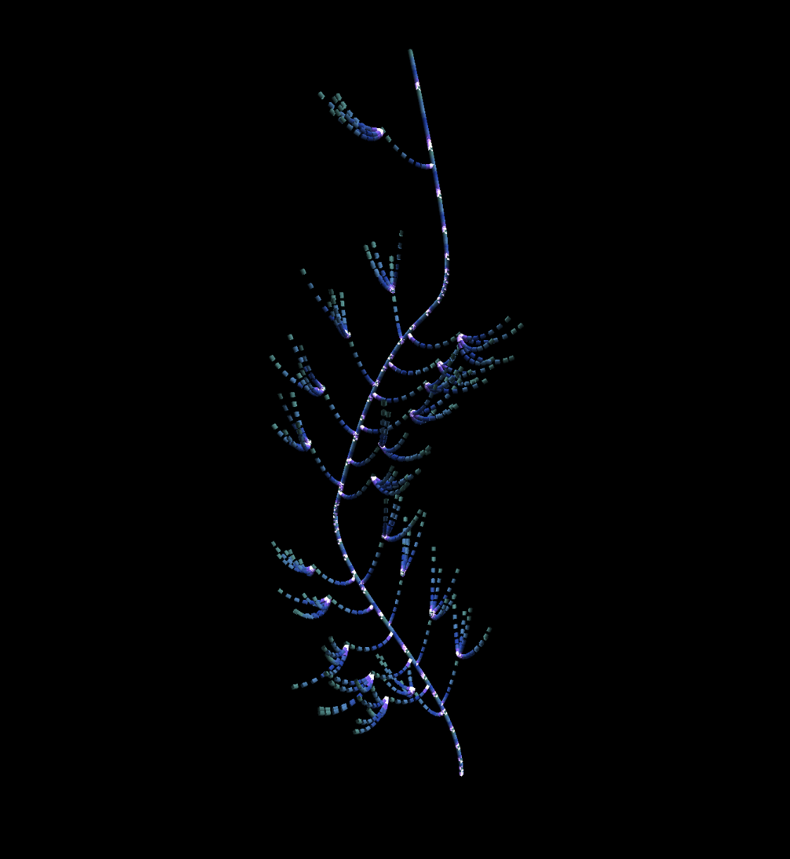
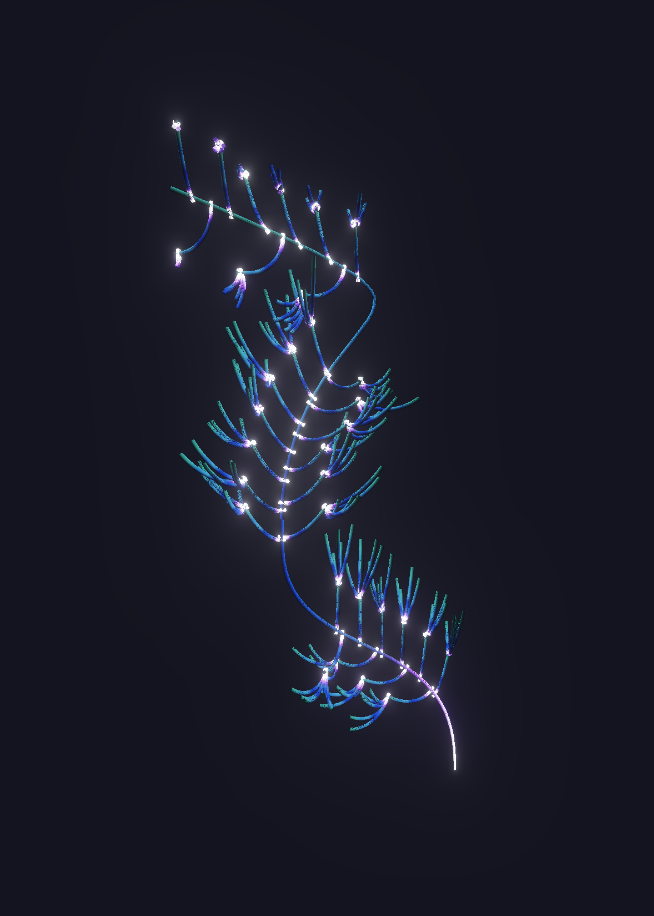
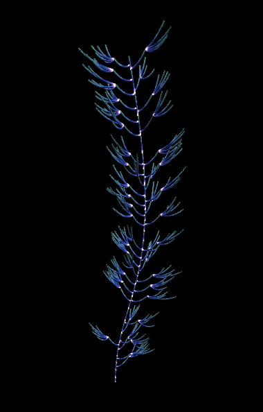
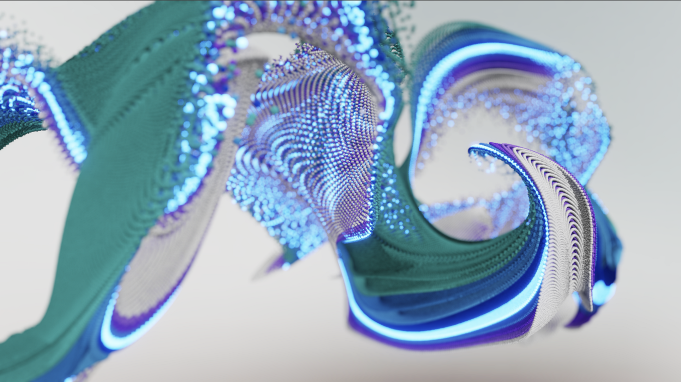
The IBM Technology Garden experience starts with an idle mode known as attractor state. This part of the installation is not data driven and we had freedom to create something impressive and always changing to catch the attention of people passing by. For this purpose, we designed a GPGPU particle system, meaning that once initiated, all the calculations were happening on the graphics card.
In our early tests, we were able to push the system to 10M particles yet 1M turned out to be enough for the final installation. To achieve realistic lighting and volume, instead of using point sprites, we use instanced planes rotated towards the camera and simulate shading of sphere in the fragment shader.
To achieve the beautiful mix of colors, we lay out our initial particles in layers that start blending during simulation creating unexpected combinations.
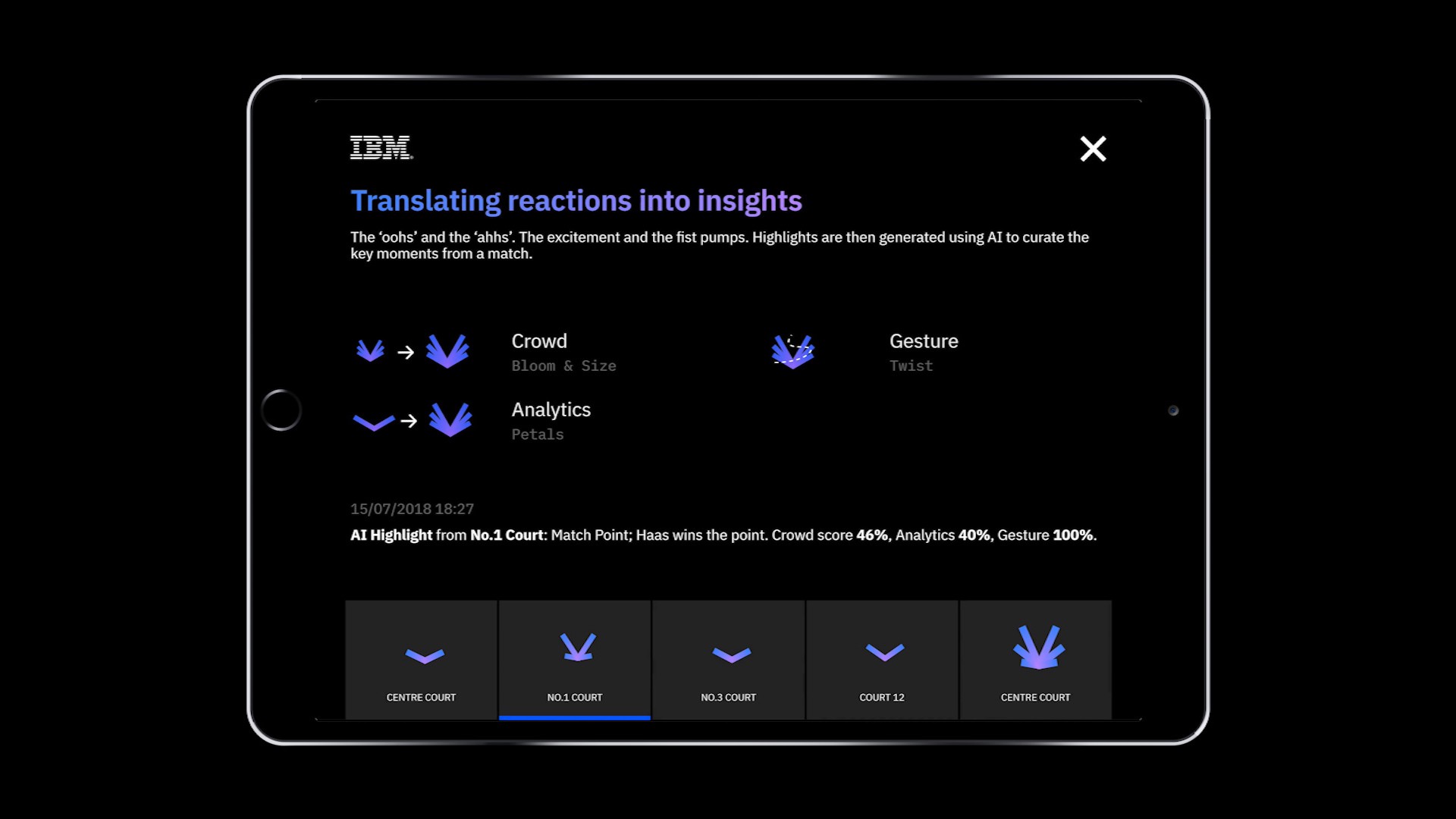
Flower A — AI Highlights
First flower is based on AI Highlights data, quick video clips showcasing the best shots and most interesting moments of a game. As we use data like player gesture and crowd excitement, we wanted to create a fast blooming flower full of expressive energy.
This is the flower where we ended up with probably the biggest amount of dead ends, as we experimented with number of approaches with the most notable two being:
- a particle system based on procedurally modelled curves
- an agent based system aka “turtle graphics” where we emit number of particles that split and replicate leaving paths behind them as they move forward used as guiding lines for a particle system
We ended up with the particles + procedural curves approach also used in Flower E where we describe it in more detail.

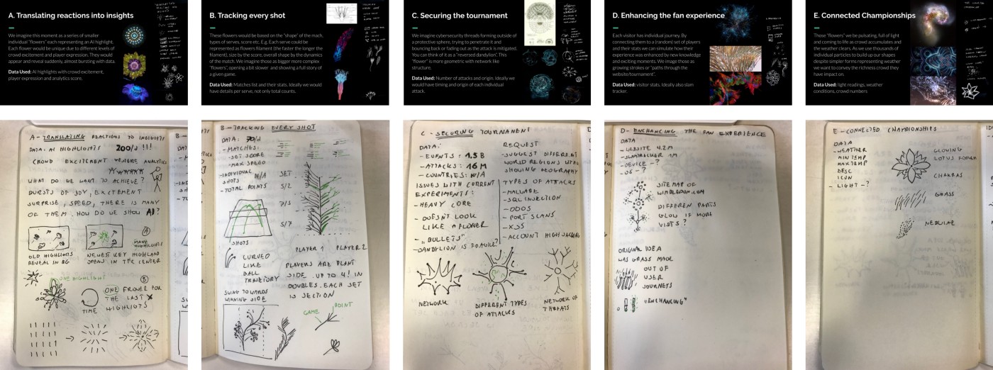
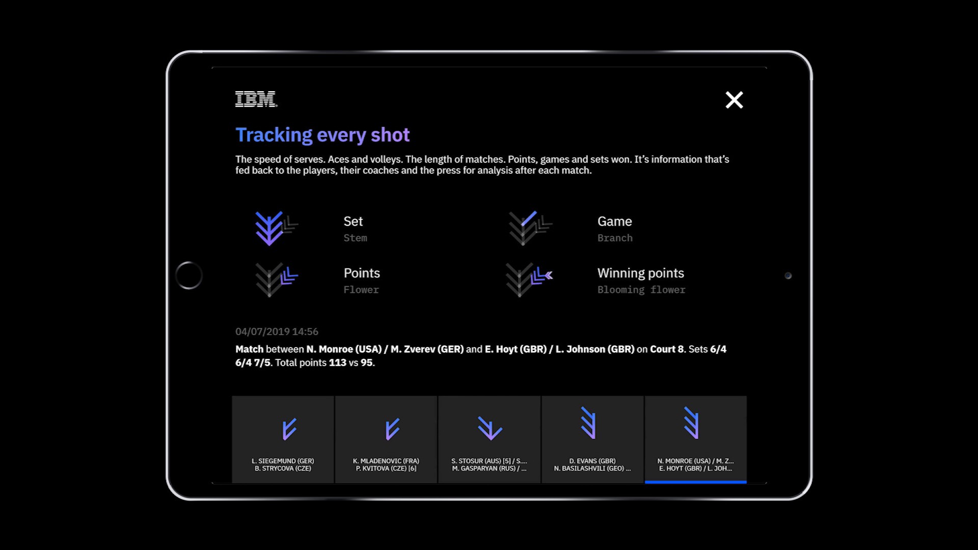
Flower B — Tracking every shot
The data that was to be used for this flower was very exciting: live match score from the games being played on a day.
The idea here was to have a vine that curved in the direction of the currently winning player. Our inspiration came from Moritz Stefaner’s (@moritz_stefaner) notabilia.net showing wild natural forms emerging from data as the branches curled and crossed based on an attribute.
Like a lot of inspiration, the idea was first penned out on paper
With this kind of idea, before getting into the slower process of 3D manipulation, it is often better just to start simple and visualise as much of the dataset as possible in the form of small multiples in order to prove that your idea will look the way you think it will.
For this project, we were fortunate enough to have access to last years’ data. We could use them to test our development and see if the idea was worth pursuing.

The results from the 2D experiment were promising, so the next move was moving the concept into 3D. A key part of the idea came from the concept of the stem curving the direction of winning player, so we started with the curve creation. It worked like this:
- Start drawing a line with points
- Displace the points by the difference in score
- Use the points to sample an adaptive bezier curve
- Remap that curve to points
- Connect the new points with cubes
- Use the distance between points to calculate where branches should be
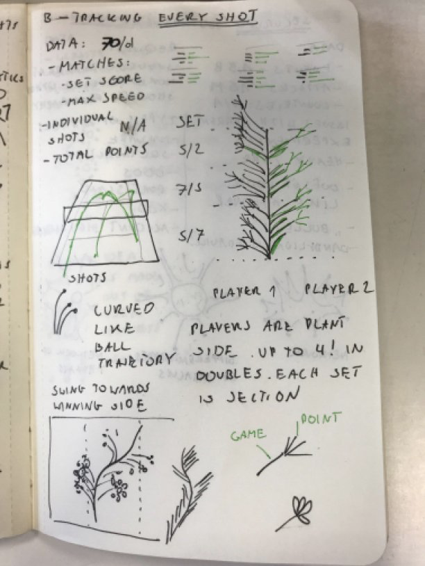
Some work in progress shots:

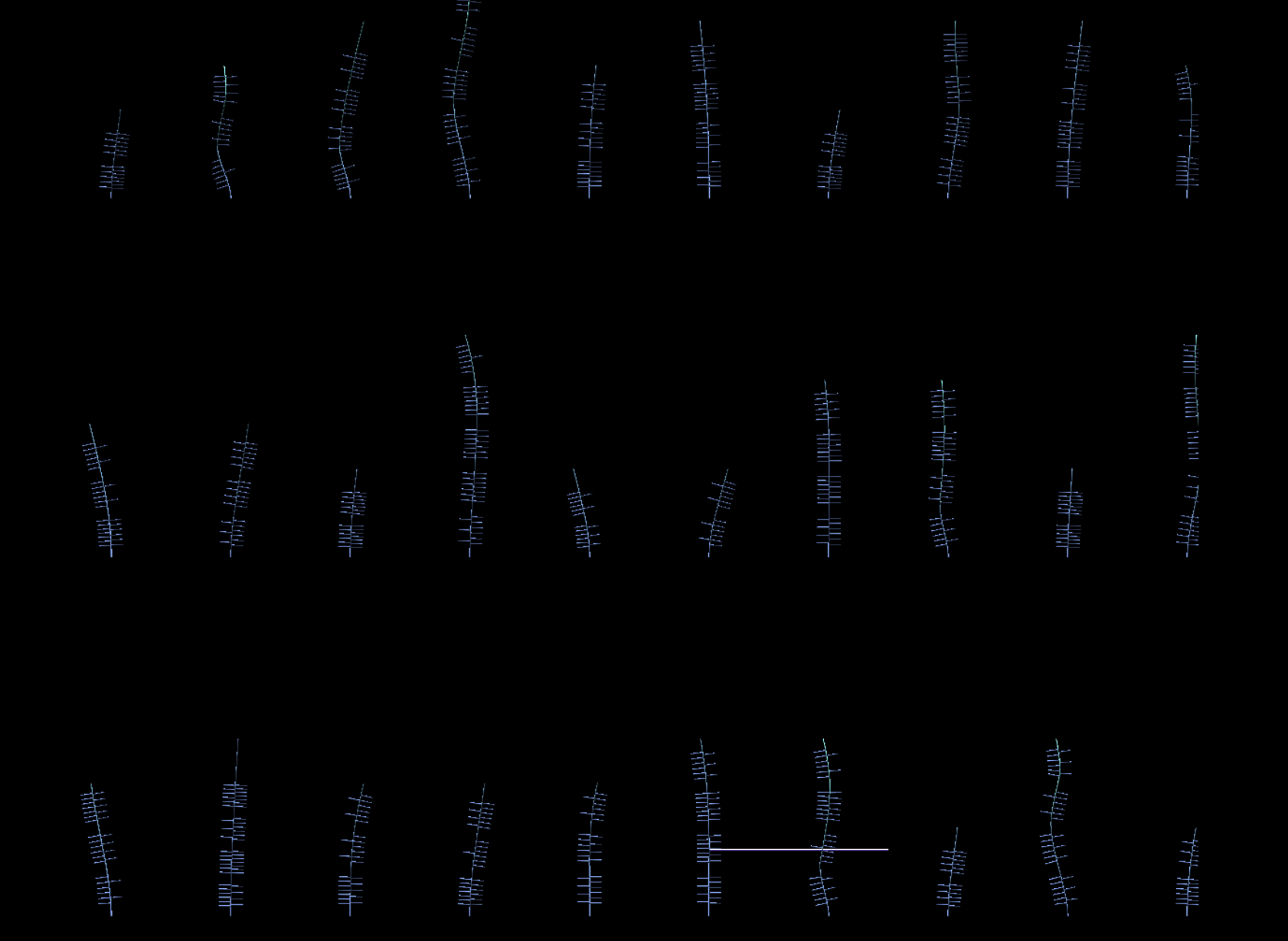
Instead of lines we use instanced cubes to keep draw calls as low as possible while easily control thickness of the branches.
One problem we faced was that the branches on the original concept were looking a little sparse.
Although the data visualisation was good it still felt like it was lacking aesthetically. We solved this by adding flowers to the ends of some of the stems to make the vine look ‘fuller’.


It really enhanced the animated version as the growth of the flowers combined with the bloom gave a great ‘pop’ effect as they revealed.
At this point, we hit another wall: although the flowers looked good, they were not data driven. It was important to remind ourselves we were working on a ‘data first’ project and as this was our richest dataset, we needed to stay true to the data. We didn’t scrap the flowers altogether though, we still bloom a flower on the point that wins the set, hence amplifying the significance of that specific point.
Once we had ported this to the lighter background and made the camera follow the growth accurately, we were left with what we presented at Wimbledon.
Below you can see the final render together with an explanation of the different visual elements.
Flower C — Securing the tournament
This is one of the flowers where we had the clearest vision of what we wanted from the start: a representation of IBM Watson deflecting or resisting potential cybersecurity attacks. Inspired by the shape of the dandelion, we decided to have a central Watson core with the dandelion seeds as attacks.
Below are some of the core explorations:

We eventually decided to go with:
Due to the sheer number of cylinders needed to create this effect, we ran into performance problems when calculating the positions of the particles using the cpu. We mitigated this issue by moving all movement calculations to the graphics card. With shaders calculating distances and positions, we could move the heavy lifting off and make the code significantly more efficient.
The result was very close to the original concept — which is a rare thing in a project with as much creative freedom as this one.
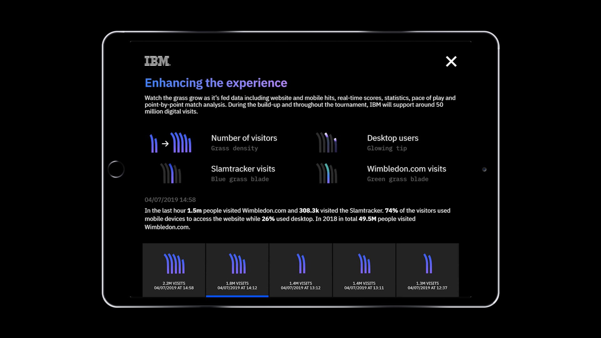
Flower D — Website Visits
This “flower” is actually more grass than flower. The density and the length of the strands depend on the number of visitors for the Wimbledon website. We tested a couple of different color schemes and PBR materials.
We even experimented with different layouts like this “underwater snake”. They were unfortunately too far from the aim of the brief.
The final colors are more in line the the overall color palette and the blades themselves are made our of instanced sphere particles instead of cubes like above.
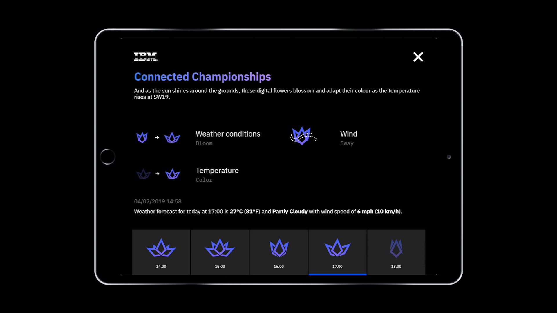
Flower E — Weather
The last flower is responding to weather data like temperature or wind speed and direction. Our first prototype was very mechanical and rigid.
The most interesting part of the flower are the leaves modelled after a leaf of hyacinth as described in the classic On Growth and Form by D’Arcy Wentworth Thompson (1945 edition, free download, page 1045 of the PDF).
We first generate the edge lines of the leaf and then distribute particles between them randomly. That creates a point cloud volume matching the shape of the leaf. The initial points are then fed to a particle system allowing us do smoke like simulation using curl noise.
Realtime dissolve test on the final hardware


Problems with glare and change of visual direction
Once we have received the hardware, we could start testing the content. Quite quickly we realised that the dark background and sci-fi color theme will not work outdoors. Our studio at Makerversity has very big windows allowing lots of sunshine which was causing large glare reflection on the screens. Some of our experiment with a brighter background didn’t have this problem and, even though we were already half way through the project, the decision has been made to switch to bright colors. A direction that has proven much more pleasing in the end as it stands out from the usual high tech look.
Post-processing tech
In order to infuse the organic forms of our flowers with a more digital look, we decided to add a slight “electric blue” glow in post processing. As most of the scenes are made out of particles, adding Screen Space Occlusion also helped to add depth to each them.
Our final post processing pipeline is setup as follows:


Screen Space Ambient Occlusion (SSAO)
SSAO is a method of approximating ambient occlusion with local shadows occurring in densely occupied areas. The actual implementation we are using here is Scalable Ambient Obscurance(SAO) developed by Morgan McGuire and ported to WebGL by Travis Fischer. The main benefit compared to traditional SSAO is better performance and nice looking shading over wider area.


Bloom
Bloom is what makes some particles seem illuminated or especially bright by blurring the area around them. To achieve very wide blur radius, we extract the brightest colors of the image and then iteratively downsample it (resize to a smaller image) and blur them at the same time. Those resulting images are then added together and composed on top of the final image. Because we use a HDR rendering pipeline, the saturation and hue of the colors stays intact.


Single pass Depth of Field (DoF)
A huge boost in the aesthetics of the project was achieved after depth of field implementation. This effect is commonly achieved using multiple passes (drawing and blurring texture multiple times), however Dennis Gustafsson (@tuxedolabs) wrote a brilliant and informative blog post about implementation of single pass DoF. This was optimal for us. Due to some of the performance limitations associated with WebGL, we wanted to keep the number of passes down to an absolute minimum to keep everything running realtime. In the end, it performed beyond even our highest expectations.
A small gotcha with this was that you need to modify the sample sized based on the resolution of the screen or your DoF will not correctly scale with resolution changes.
LUT color grading
For a final touch of artistic flexibility, we decided having fine control of the colour grading was important so we implemented 2 systems.
Firstly, we implemented Lookup Tables (LUTs): these works by having a hue cube flattened and saved onto a texture in slices. During this pass you can look up the colour of the current fragment at its position in the lookup table to get a new colour. This way you can import your lookup table into image editing software and alter the curves/colour profiles and the same operation will happen to your realtime colours.


The second control was simply sliders for brightness, contrast, and exposure. Due to the dynamic nature of coding in Nodes this gave us very fast and flexible control, allowing us to play with values as the scene is running and without the need for external software.
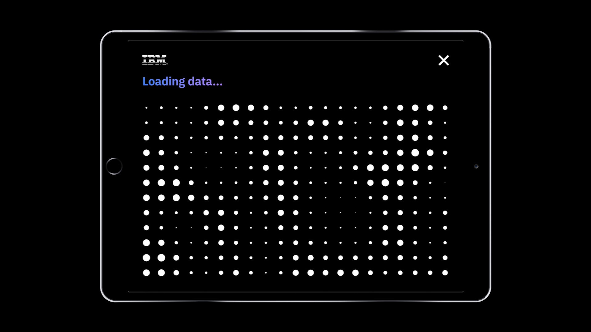
Companion iPad controller
We wanted the controller to be as simple and user-friendly as possible to keep the focus on the main screen. The iPad is in the hands of a host who explains what is visible on screen and go through the timeline of each flower depending on visitors interests.

In this spirit, we have built a React app that would be saved as an App on the iPad’s homescreen. The controller app was a good candidate to go full functional JavaScript with the use of React hooks. Based on Create React App, it is enhanced with the foundations of many other apps: react-router, react-intl and emotion. It communicates with the Electron App –the one running the server and the display– via socket.io.
The user flow is straightforward. The home page presents the 5 flowers:
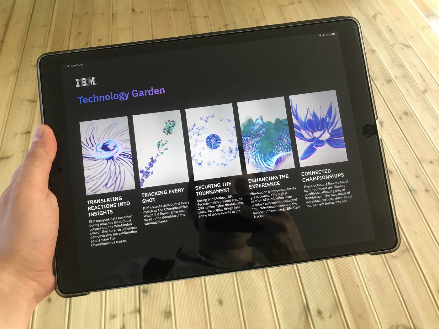
After tapping on one of the five flowers, we fetch in realtime the latest tournament data available. We then land on the selected flower screen which includes an explanation of the data used and how they influence the shape of the flower. A timeline with previous data is also present so the visitor can experienced different flower for each dataset.

The device offers a second reading layer for the data and serve as a support to tell the story behind the data.
Parting words
At Variable, we believe that data can be experienced, not only counted. IBM Technology Garden achieved both of those goals as we managed to create something beautiful yet readable and true to the data.
Thanks again to GPJ for giving us this opportunity and creative freedom, and to IBM for the amazing work on the data side.
If you have any questions or interesting project you would like to discuss, say hi on Twitter @variable_io or drop us a line at hello@variable.io.
Credits:
The cover image was generated using ofxTSNE by Gene Kogan (@genekogan) and ofxAssignment by Kyle McDonald based on ImageTSNELive example from Machine Learning for Artists also by Gene Kogan.
Case study written by Marcin Ignac (@marcinignac), Damien Seguin (@dmnsgn) and Simon Harris (@simonharrisco) from Variable.